Getting started with R
Session 3 of 4: Data visualisation
Mean size vs. total abundance
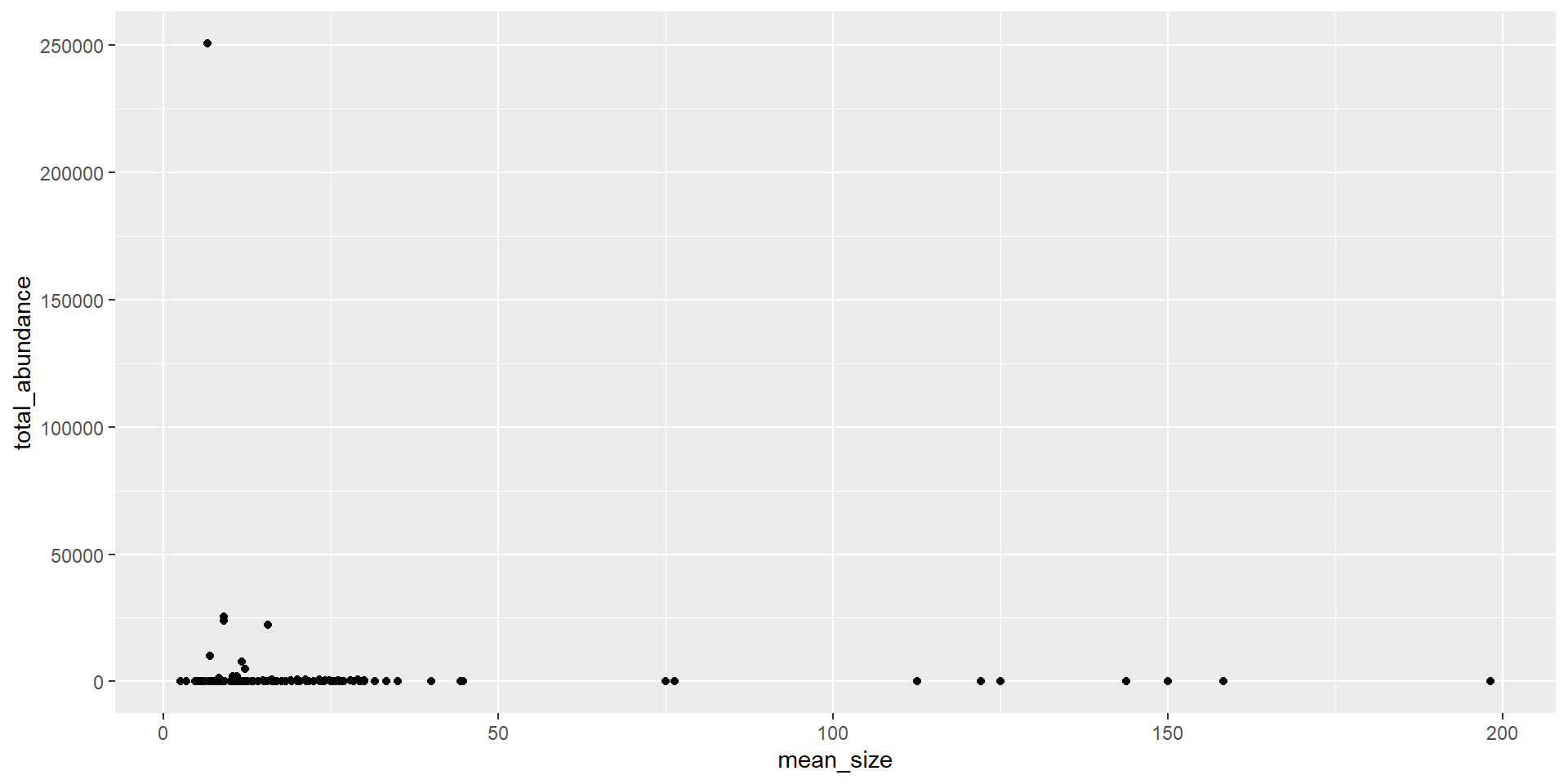
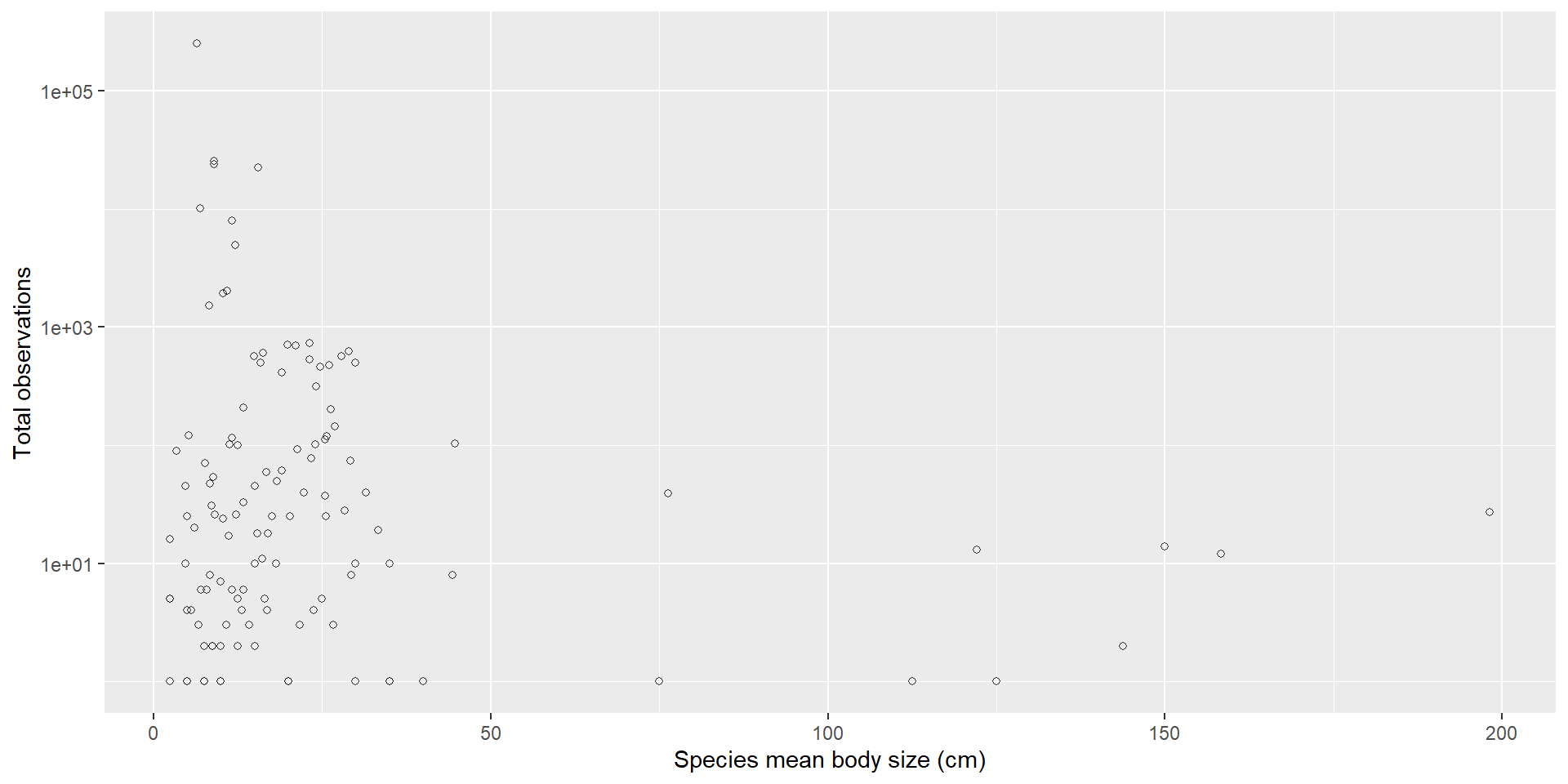
A cleaner plot
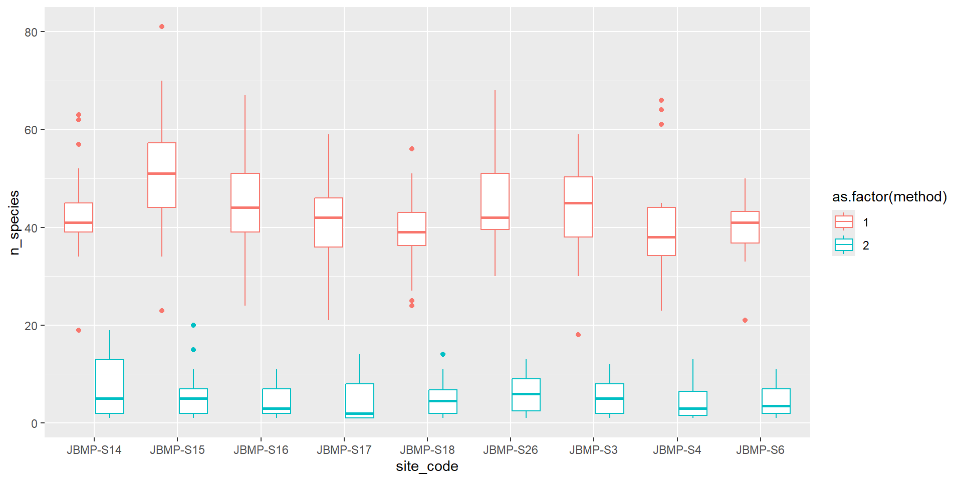
Boxplot (Categorical vs numeric)
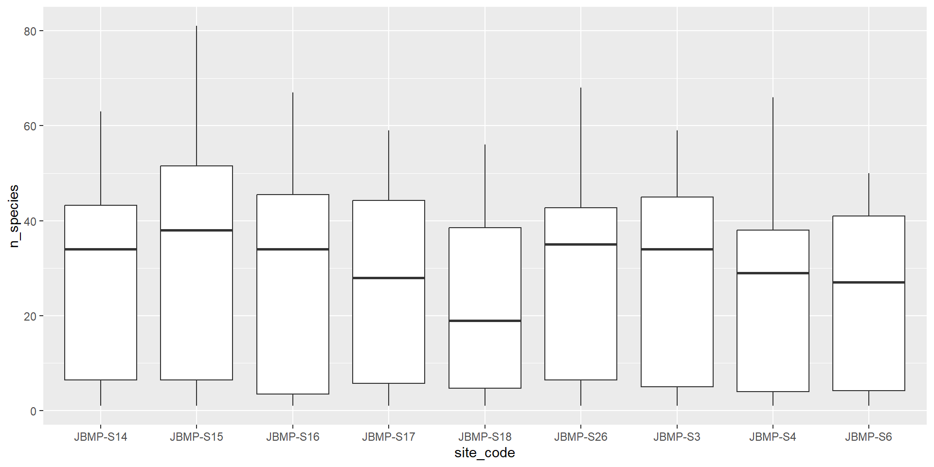
Boxplot coloured by method
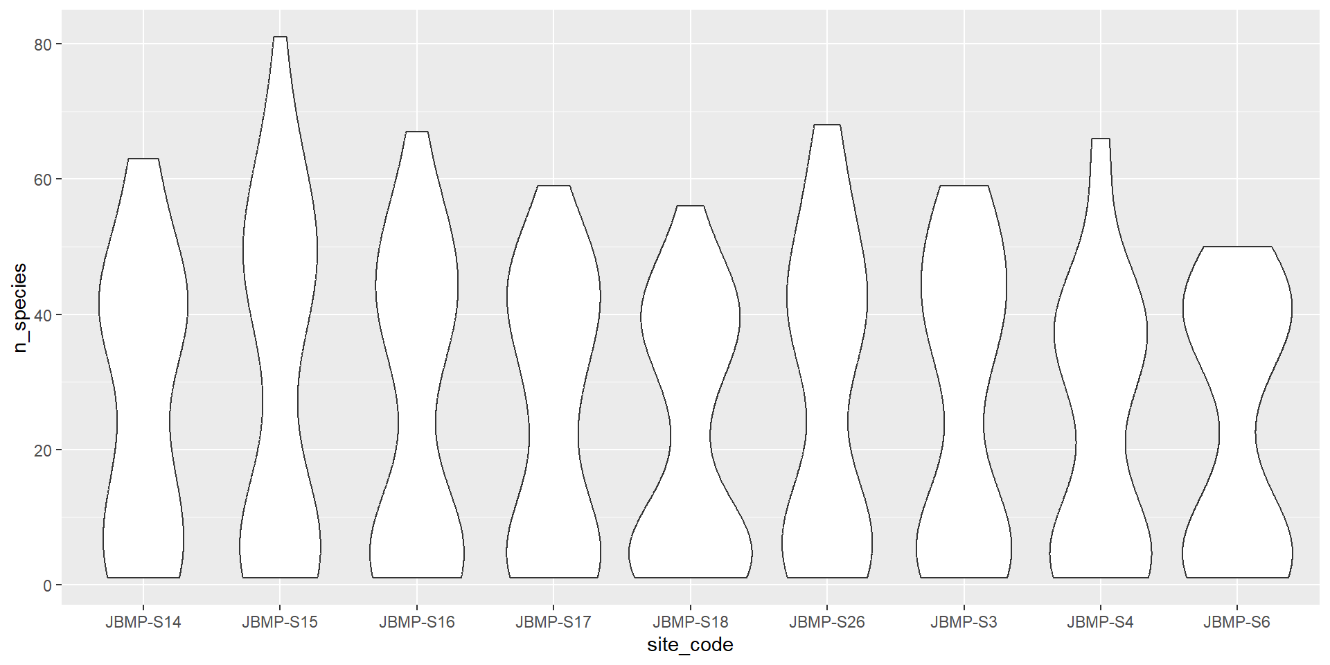
Violin plots (Categorical vs numeric)
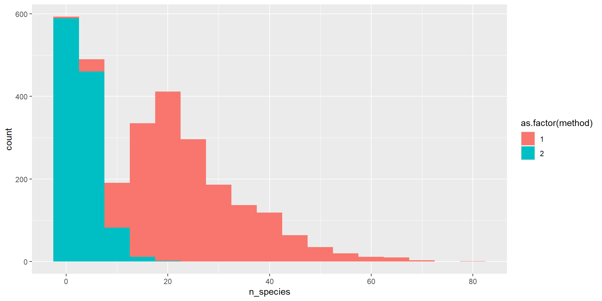
Barplots (Categorical vs numeric)
# For a barplot you might want the bar to represent the mean or median.
# how do barplots differ from violin or boxplots?
nspp_bysurv_bysite %>%
  filter(site_code %in% selected_sites) %>%
  summarise(
    mean_diversity = mean(n_species, na.rm = TRUE),
    .by = c(site_code, method)
  ) %>%
  ggplot() +
  aes(x = site_code, y = mean_diversity, fill = as.factor(method)) +
  geom_col(position = "dodge") +
  labs(fill = "Method", x = "Site Code", y = "Mean number of species")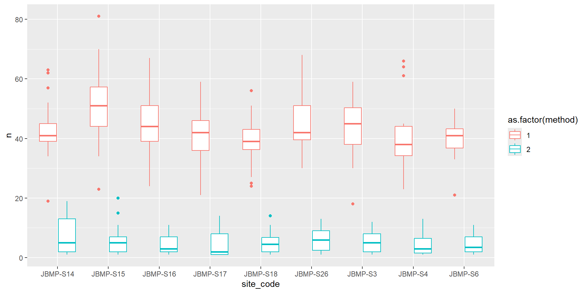
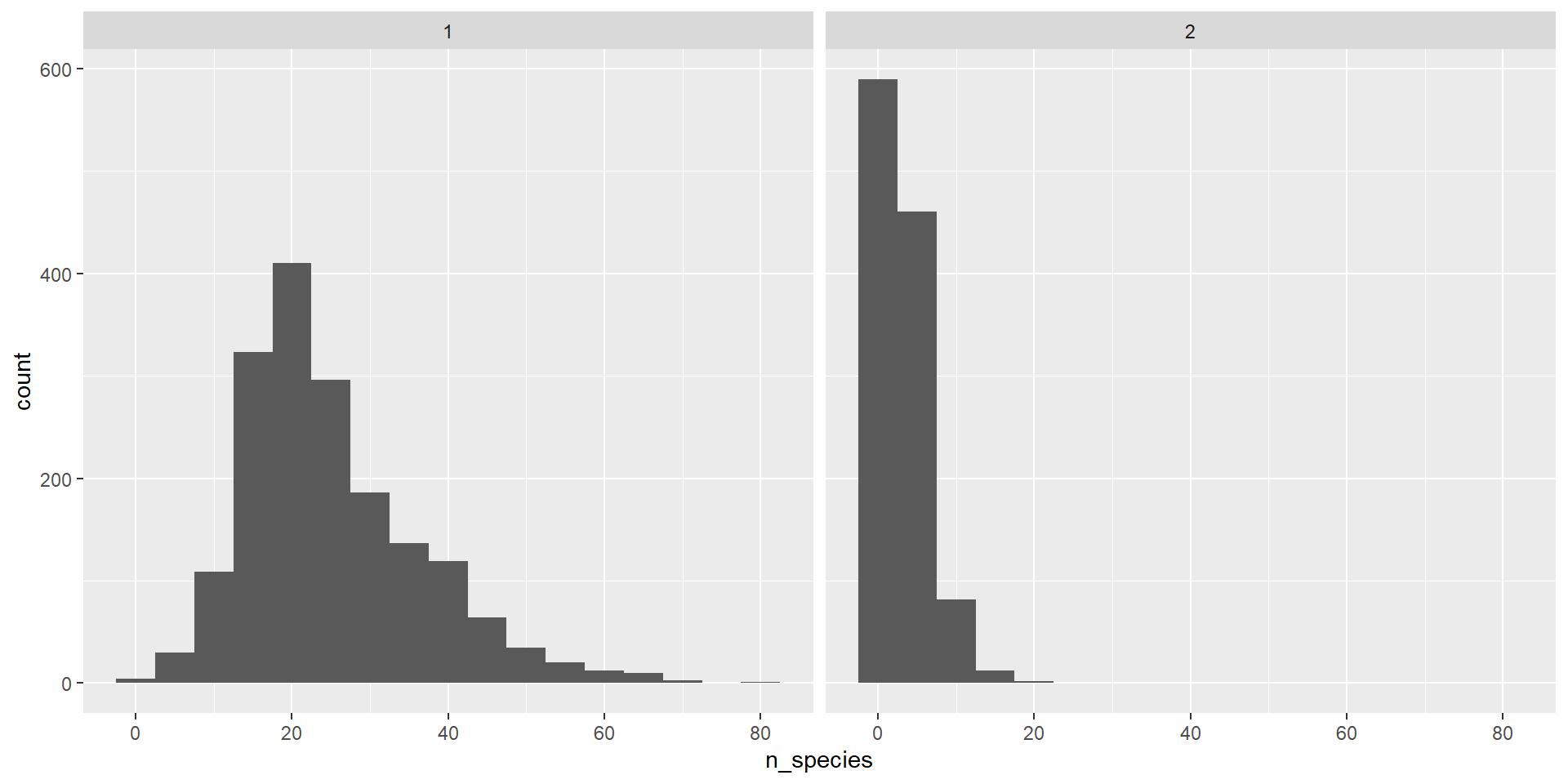
One numerical variable

Extra - multiple plots
- Sometime you want to split up plots by a factor